
Problem
How can I style the various types of screen components?Solution
1 Components without prefixes
Components without prefixes are components that have a single style which tells the component how it must be rendered. It can be identified in the style tab of the component as shown in the figure below.
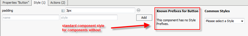
Styling these components is easily done by choosing the appropriate style from common style dropdown.
In addition the user is allowed to reference a css class which will be applied on the component. The key for the class reference is 'class'. In the value part the actual name of the css class must be given.
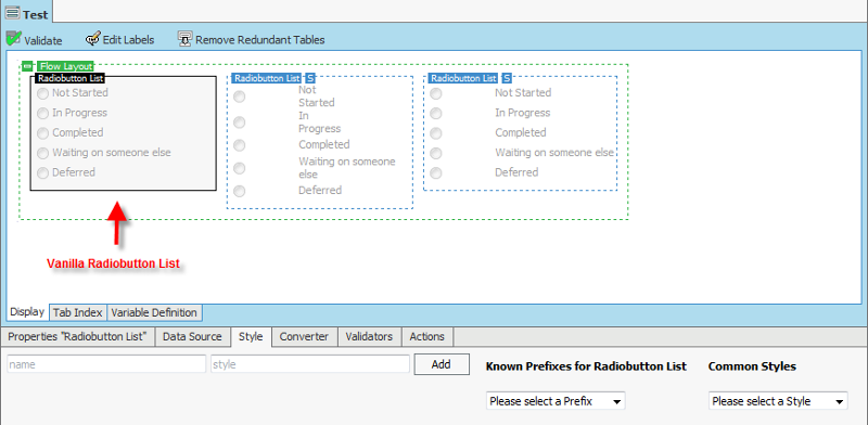
2 Components with prefixes
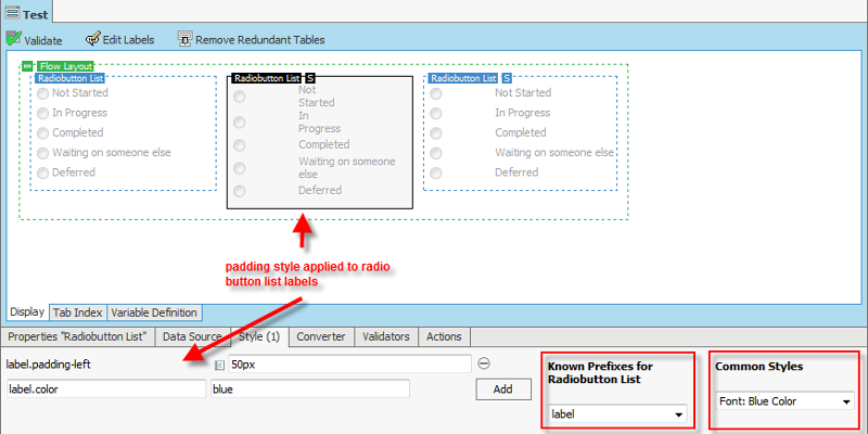
Some components have prefixes for styles. If a prefix is selected the common style selection is applied to a sub section of the component. For example the 'Radiobutton List' component is a component with prefixes for styles. The component allows the user to apply special styles for the 'radio' button and the 'label' for the radio button.
The following are some screenshots which show how styles are applied to the Radiobutton List. The same pattern applies to all components with prefixes.
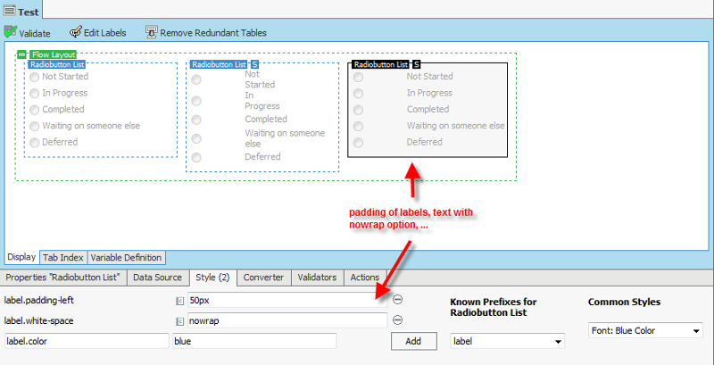
Because some components are limiting the space for rendering text, unwanted line breaks may be observed when applying additional spacing to label or radio button, as shown in the next figure.
Using the nowrap css style for text solves the text rendering problem.
Comments (0)
Developer is transitioning to Appway Community
All material for Appway 6 is still available here on developer.appway.com during the transition to Appway Community.
Material for Appway 6.3 and Appway 7 is available in the Knowledge Base on community.appway.com.Note: The Community Blog, our Forum, and the Support system are available exclusively on Appway Community.
Any questions or feedback? Please contact community@appway.com
Material for Appway 6.3 and Appway 7 is available in the Knowledge Base on community.appway.com.
Note: The Community Blog, our Forum, and the Support system are available exclusively on Appway Community. Any questions or feedback? Please contact community@appway.comSee Also
COOKBOOK
Appway and accessibilityChanges to the Table Component in Appway 6Navigating through Long Screens Using the Adaptive Table Of Contents ComponentCreating Standards-Based HTML in 5.1 Building a simple puzzle game in AppwayFORUMBLM - Background color - TemplateChange Screen Components based on screen sizeInternationalization/Localization, Skinning, Personalization Handling of errors in variable default expressionsRealising multi select file upload (customized file picker vs. drag and drop)